

一、建立环境
conda create -n chan python=2.7
利用Anaconda建立虚拟环境的时候,会显示虚拟环境的保存位置,比如:C:\ProgramData\Anaconda3\envs\chan
二、pycharm打开虚拟环境
记得选择“Exsiting envirement”
三、安装JQData
使用这里的方法安装失败,后来直接使用pip install jqdatasdk安装成功。
四、调试
单击打断点,双击取消断点
程序执行到断点处,会停住,并在这一行显示蓝色,放到断点的那一行会显示所有数据。点击F8继续执行代码。
跳到下一个断点。
F7
进入函数
F9
只在断点和交互处停止,快速调式。shift + f9 运行debug模式
五、测试代码
# -*- coding: UTF-8 –*-
from chan_lun_util import *
import numpy as np
import time
from jqdatasdk import *
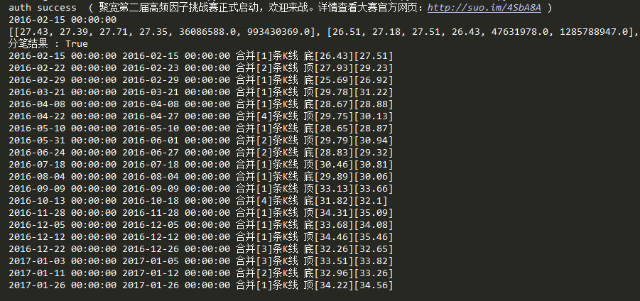
auth('13xxxxxxx80','a4')
nan = 0
stock_code = '601318.XSHG'
start_date = '2016-02-05'
end_date = '2017-02-07'
quotes = get_price(stock_code, start_date, end_date, frequency='daily',skip_paused=False,fq='pre')
quotes[quotes['volume']==0]=np.nan
quotes= quotes.dropna()
# 处理以上分笔结果,组织成实际上图的点
k_line_list = []
date_list = quotes.index.tolist()
print(date_list[1])
data_per_day = quotes.values.tolist()
print(data_per_day)
x_date_list = quotes.index.values.tolist()
for index in range(len(date_list)):
date_time = date_list[index]
open_price = data_per_day[index][0]
close_price = data_per_day[index][1]
high_price = data_per_day[index][2]
low_price = data_per_day[index][3]
k_line_dto = KLineDTO(date_time,
date_time,
date_time,
open_price, high_price, low_price, close_price)
k_line_list.append(k_line_dto)
# 1.K线合并
merge_line_list = find_peak_and_bottom(k_line_list, "down")
# 2.分笔
fenbi_result,final_result_array,fenbi_seq_list = fen_bi(merge_line_list)
# 3.得到分笔结果,计算坐标显示
x_fenbi_seq = []
y_fenbi_seq = []
for i in range(len(final_result_array)):
if final_result_array[i]:
m_line_dto = merge_line_list[fenbi_seq_list[i]]
if m_line_dto.is_peak == 'Y':
peak_time = None
for k_line_dto in m_line_dto.member_list[::-1]:
if k_line_dto.high == m_line_dto.high:
# get_price返回的日期,默认时间是08:00:00
peak_time = k_line_dto.begin_time.strftime('%Y-%m-%d') +' 08:00:00'
break
x_fenbi_seq.append(x_date_list.index(long(time.mktime(datetime.strptime(peak_time, "%Y-%m-%d %H:%M:%S").timetuple())*1000000000)))
y_fenbi_seq.append(m_line_dto.high)
if m_line_dto.is_bottom == 'Y':
bottom_time = None
for k_line_dto in m_line_dto.member_list[::-1]:
if k_line_dto.low == m_line_dto.low:
# get_price返回的日期,默认时间是08:00:00
bottom_time = k_line_dto.begin_time.strftime('%Y-%m-%d') +' 08:00:00'
break
x_fenbi_seq.append(x_date_list.index(long(time.mktime(datetime.strptime(bottom_time, "%Y-%m-%d %H:%M:%S").timetuple())*1000000000)))
y_fenbi_seq.append(m_line_dto.low)
四、折线图
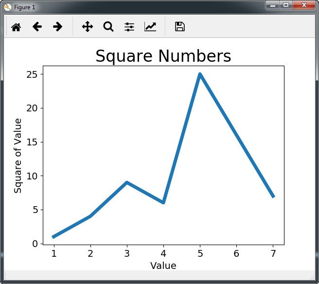
import matplotlib.pyplot as plt

#图形输入值
input_values = [1,2,3,4,5,7]
#图形输出值
squares = [1,4,9,6,25,7]

# plot根据列表绘制出有意义的图形,linewidth是图形线宽,可省略
plt.plot(input_values,squares,linewidth=5)
#设置图标标题
plt.title("Square Numbers",fontsize = 24)
#设置坐标轴标签
plt.xlabel("Value",fontsize = 14)
plt.ylabel("Square of Value",fontsize = 14)
#设置刻度标记的大小
plt.tick_params(axis='both',labelsize = 14)
#打开matplotlib查看器,并显示绘制图形
plt.show()
备注:其实只需要前面三行代码,就可以出效果了。
展示:
按时间轴
import pandas
import matplotlib
import mpl_finance
import matplotlib.pyplot as plt
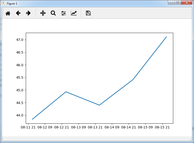
def stockPricePlot(ticker):
# Step 1. Load Data
history = pandas.read_csv('../02. Data/01. IntradayUS/'+ticker+'.csv', parse_dates=True, index_col=0)
# Step 2. Data Manipulation
close = history['close']
close = close.resample('1D').ohlc() #根据close生成一天的4个价格
close = close.reset_index() #增加一个额外的索引列,从0开始
plt.plot(close['timestamp'],close['close'],linewidth=2)
plt.show()
stockPricePlot('AAON')
展示:
五、折线+均线+成交量
import pandas
import matplotlib
import mpl_finance
import matplotlib.pyplot as plt
from jqdatasdk import *

matplotlib.style.use('ggplot')

auth('138xxxxxxxx','a4')

stock_code = '600031.XSHG'
start_date = '2018-08-17'
end_date = '2019-08-17'

def getData():
	"""通过聚宽平台获取数据"""
	quotes = get_price(stock_code, start_date, end_date, frequency='daily',skip_paused=False,fq='pre')
	return quotes


def stockPricePlot(df):
	#生成100天均线数据
	df['100ma'] = df['close'].rolling(window=100,min_periods=0).mean()
	ax1 = plt.subplot2grid((6,1),(0,0),rowspan=5,colspan=1)
	ax2 = plt.subplot2grid((6,1),(5,0),rowspan=5,colspan=1,sharex=ax1)
	ax1.plot(df.index,df['close'])
	ax1.plot(df.index,df['100ma'])
	ax2.bar(df.index,df['volume'])
	plt.show()

df = getData()
stockPricePlot(df)
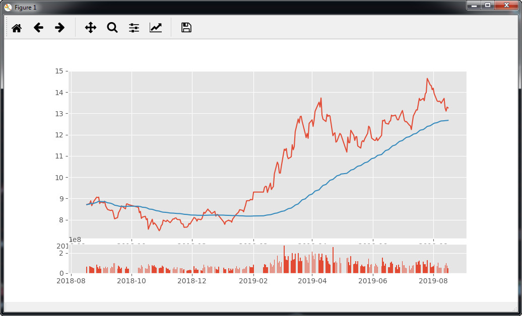
成果展示:
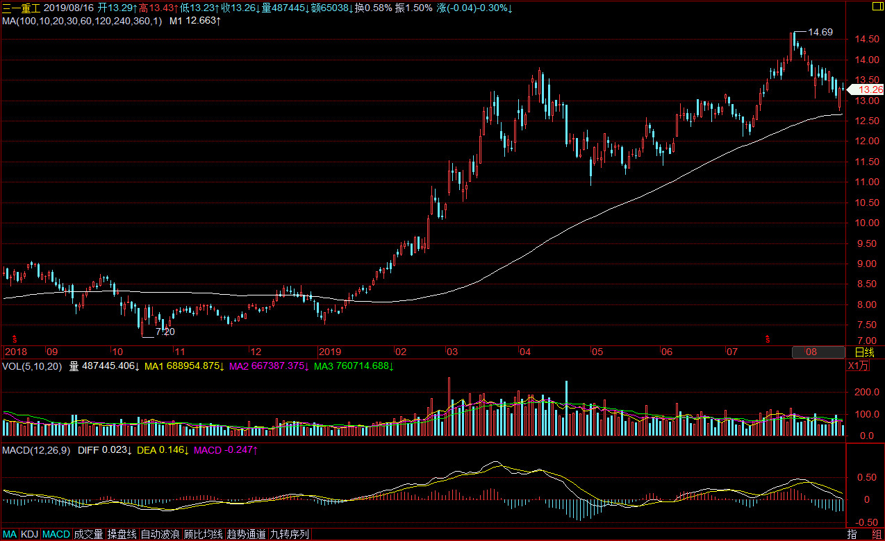
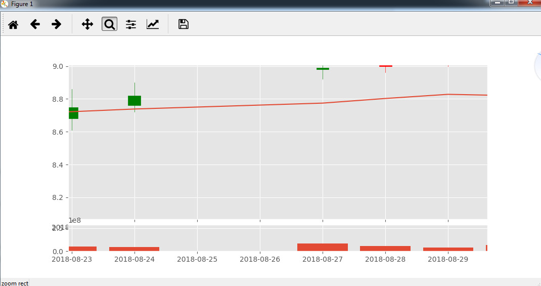
六、K线合成
import pandas
import matplotlib
import mpl_finance
import matplotlib.pyplot as plt
from jqdatasdk import *

matplotlib.style.use('ggplot')

auth('138xxxxxxxx','axxx4')

stock_code = '600031.XSHG'
start_date = '2018-08-17'
end_date = '2019-08-17'

def getData():
	"""通过聚宽平台获取数据"""
	quotes = get_price(stock_code, start_date, end_date, frequency='30m', fields=['open','close','high', 'low','volume'],skip_paused=False,fq='pre')
	# print(quotes)
	return quotes


def stockPricePlot(df):
	# #获取ohlc,同样带了时间的index
	period_stock_date = df.resample('1D').last()
	#日线的[open]等于那一天的第一个30分钟K的[open]
	period_stock_date['open'] = df['open'].resample('1D').first()
	period_stock_date['high'] = df['high'].resample('1D').max()
	period_stock_date['low'] = df['low'].resample('1D').min()
	period_stock_date['close'] = df['low'].resample('1D').last()
	period_stock_date['volume'] = df['volume'].resample('1D').sum()


	#股票在有些天没有交易,将这些天去掉
	period_stock_date = period_stock_date[period_stock_date['open'].notnull()]
	# #生成100天均线数据
	period_stock_date['100ma'] = period_stock_date['close'].rolling(window=100,min_periods=0).mean()
	ohlc = period_stock_date[['open', 'high', 'low', 'close']]
	ohlc.index.name = 'timestamp'
	ohlc = ohlc.reset_index()
	#对日期格式进行转换,转换后变成了737278.0、737279.0这样的形式。
	ohlc['timestamp'] = ohlc['timestamp'].map(matplotlib.dates.date2num)
	ax1 = plt.subplot2grid((6,1),(0,0),rowspan=5,colspan=1)
	ax2 = plt.subplot2grid((6,1),(5,0),rowspan=5,colspan=1,sharex=ax1)
	mpl_finance.candlestick_ohlc(ax=ax1, quotes=ohlc.values, width=0.20, colorup='g', colordown='r')
	ax1.plot(period_stock_date['100ma'])
	ax2.bar(ohlc['timestamp'],period_stock_date['volume'])
	plt.show()


df = getData()
stockPricePlot(df)
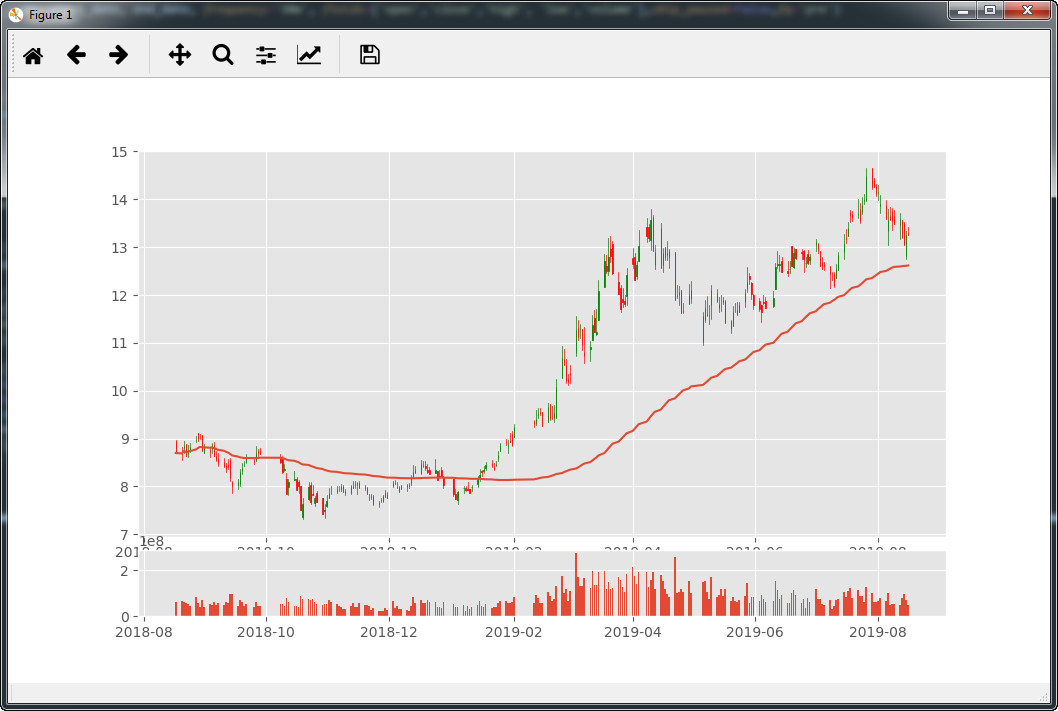
经测试,从30分钟合成日线完全正确:
成果展示:
不过这里还是有一个bug,就是有些日期print出来明明没有,但是在plot.show()的图表中却有这一天。
然后发现真的存在这个问题:
https://www.jianshu.com/p/c10e57ccc7ba?utm_campaign=maleskine&utm_content=note&utm_medium=seo_notes&utm_source=recommendation