最近在学习CSS,发现这个手写的css网页设计,觉得非常有用,现分享如下:
一、初稿
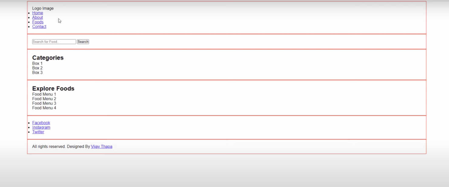
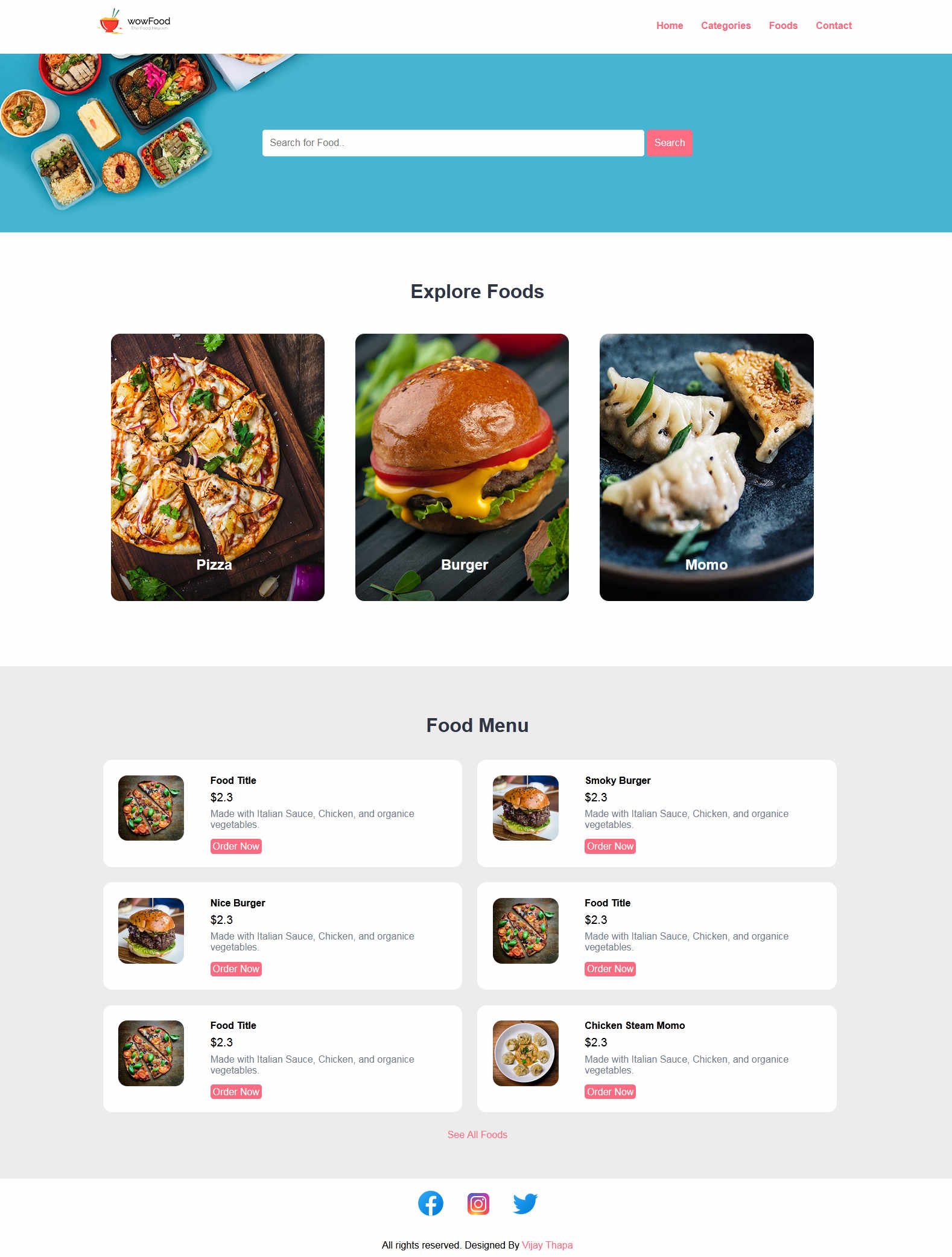
成果:
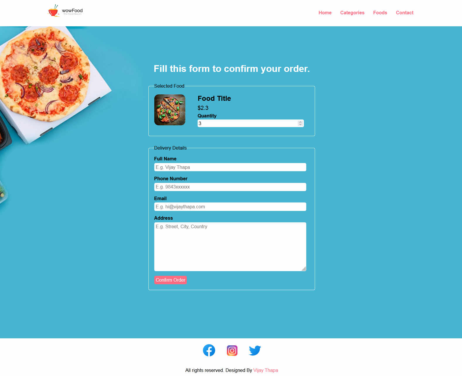
订单页面:
二、代码
index.html
<!DOCTYPE html>
<html lang="en">
<head>
    <meta charset="UTF-8">
    <!-- Important to make website responsive -->
    <meta name="viewport" content="width=device-width, initial-scale=1.0">
    <title>Restaurant Website</title>

    <!-- Link our CSS file -->
    <link rel="stylesheet" href="css/style.css">
</head>

<body>
    <!-- Navbar Section Starts Here -->
    <section class="navbar">
        <div class="container">
            <div class="logo">
                <a href="#" title="Logo">
                    <img src="images/logo.png" alt="Restaurant Logo" class="img-responsive">
                </a>
            </div>

            <div class="menu text-right">
                <ul>
                    <li>
                        <a href="index.html">Home</a>
                    </li>
                    <li>
                        <a href="categories.html">Categories</a>
                    </li>
                    <li>
                        <a href="foods.html">Foods</a>
                    </li>
                    <li>
                        <a href="#">Contact</a>
                    </li>
                </ul>
            </div>

            <div class="clearfix"></div>
        </div>
    </section>
    <!-- Navbar Section Ends Here -->

    <!-- fOOD sEARCH Section Starts Here -->
    <section class="food-search text-center">
        <div class="container">

            <form action="food-search.html" method="POST">
                <input type="search" name="search" placeholder="Search for Food.." required>
                <input type="submit" name="submit" value="Search" class="btn btn-primary">
            </form>

        </div>
    </section>
    <!-- fOOD sEARCH Section Ends Here -->

    <!-- CAtegories Section Starts Here -->
    <section class="categories">
        <div class="container">
            <h2 class="text-center">Explore Foods</h2>

            <a href="category-foods.html">
            <div class="box-3 float-container">
                <img src="images/pizza.jpg" alt="Pizza" class="img-responsive img-curve">

                <h3 class="float-text text-white">Pizza</h3>
            </div>
            </a>

            <a href="#">
            <div class="box-3 float-container">
                <img src="images/burger.jpg" alt="Burger" class="img-responsive img-curve">

                <h3 class="float-text text-white">Burger</h3>
            </div>
            </a>

            <a href="#">
            <div class="box-3 float-container">
                <img src="images/momo.jpg" alt="Momo" class="img-responsive img-curve">

                <h3 class="float-text text-white">Momo</h3>
            </div>
            </a>

            <div class="clearfix"></div>
        </div>
    </section>
    <!-- Categories Section Ends Here -->

    <!-- fOOD MEnu Section Starts Here -->
    <section class="food-menu">
        <div class="container">
            <h2 class="text-center">Food Menu</h2>

            <div class="food-menu-box">
                <div class="food-menu-img">
                    <img src="images/menu-pizza.jpg" alt="Chicke Hawain Pizza" class="img-responsive img-curve">
                </div>

                <div class="food-menu-desc">
                    <h4>Food Title</h4>
                    <p class="food-price">$2.3</p>
                    <p class="food-detail">
                        Made with Italian Sauce, Chicken, and organice vegetables.
                    </p>
                    <br>

                    <a href="order.html" class="btn btn-primary">Order Now</a>
                </div>
            </div>

            <div class="food-menu-box">
                <div class="food-menu-img">
                    <img src="images/menu-burger.jpg" alt="Chicke Hawain Pizza" class="img-responsive img-curve">
                </div>

                <div class="food-menu-desc">
                    <h4>Smoky Burger</h4>
                    <p class="food-price">$2.3</p>
                    <p class="food-detail">
                        Made with Italian Sauce, Chicken, and organice vegetables.
                    </p>
                    <br>

                    <a href="#" class="btn btn-primary">Order Now</a>
                </div>
            </div>

            <div class="food-menu-box">
                <div class="food-menu-img">
                    <img src="images/menu-burger.jpg" alt="Chicke Hawain Burger" class="img-responsive img-curve">
                </div>

                <div class="food-menu-desc">
                    <h4>Nice Burger</h4>
                    <p class="food-price">$2.3</p>
                    <p class="food-detail">
                        Made with Italian Sauce, Chicken, and organice vegetables.
                    </p>
                    <br>

                    <a href="#" class="btn btn-primary">Order Now</a>
                </div>
            </div>

            <div class="food-menu-box">
                <div class="food-menu-img">
                    <img src="images/menu-pizza.jpg" alt="Chicke Hawain Pizza" class="img-responsive img-curve">
                </div>

                <div class="food-menu-desc">
                    <h4>Food Title</h4>
                    <p class="food-price">$2.3</p>
                    <p class="food-detail">
                        Made with Italian Sauce, Chicken, and organice vegetables.
                    </p>
                    <br>

                    <a href="#" class="btn btn-primary">Order Now</a>
                </div>
            </div>

            <div class="food-menu-box">
                <div class="food-menu-img">
                    <img src="images/menu-momo.jpg" alt="Chicke Hawain Momo" class="img-responsive img-curve">
                </div>

                <div class="food-menu-desc">
                    <h4>Chicken Steam Momo</h4>
                    <p class="food-price">$2.3</p>
                    <p class="food-detail">
                        Made with Italian Sauce, Chicken, and organice vegetables.
                    </p>
                    <br>

                    <a href="#" class="btn btn-primary">Order Now</a>
                </div>
            </div>


            <div class="clearfix"></div>


        </div>

        <p class="text-center">
            <a href="#">See All Foods</a>
        </p>
    </section>
    <!-- fOOD Menu Section Ends Here -->

    <!-- social Section Starts Here -->
    <section class="social">
        <div class="container text-center">
            <ul>
                <li>
                    <a href="#"><img src="https://img.icons8.com/fluent/50/000000/facebook-new.png"/></a>
                </li>
                <li>
                    <a href="#"><img src="https://img.icons8.com/fluent/48/000000/instagram-new.png"/></a>
                </li>
                <li>
                    <a href="#"><img src="https://img.icons8.com/fluent/48/000000/twitter.png"/></a>
                </li>
            </ul>
        </div>
    </section>
    <!-- social Section Ends Here -->

    <!-- footer Section Starts Here -->
    <section class="footer">
        <div class="container text-center">
            <p>All rights reserved. Designed By <a href="#">Vijay Thapa</a></p>
        </div>
    </section>
    <!-- footer Section Ends Here -->

</body>
</html>
2.css
/*
    Author: Vijay Thapa;
    Theme: Restaurant Food Order;
    version: 1.0;
*/

/* CSS for All */
*{
    margin: 0 0;
    padding: 0 0;
    font-family: Arial, Helvetica, sans-serif;
}
.container{
    width: 80%;
    margin: 0 auto;
    padding: 1%;
}
.img-responsive{
    width: 100%;
}
.img-curve{
    border-radius: 15px;
}

.text-right{
    text-align: right;
}
.text-center{
    text-align: center;
}
.text-left{
    text-align: left;
}
.text-white{
    color: white;
}

.clearfix{
    clear: both;
    float: none;
}

a{
    color: #ff6b81;
    text-decoration: none;
}
a:hover{
    color: #ff4757;
}

.btn{
    padding: 1%;
    border: none;
    font-size: 1rem;
    border-radius: 5px;
}
.btn-primary{
    background-color: #ff6b81;
    color: white;
    cursor: pointer;
}
.btn-primary:hover{
    color: white;
    background-color: #ff4757;
}
h2{
    color: #2f3542;
    font-size: 2rem;
    margin-bottom: 2%;
}
h3{
    font-size: 1.5rem;
}
.float-container{
    position: relative;
}
.float-text{
    position: absolute;
    bottom: 50px;
    left: 40%;
}
fieldset{
    border: 1px solid white;
    margin: 5%;
    padding: 3%;
    border-radius: 5px;
}


/* CSSS for navbar section */

.logo{
    width: 10%;
    float: left;
}
.menu{
    line-height: 60px;
}
.menu ul{
    list-style-type: none;
}

.menu ul li{
    display: inline;
    padding: 1%;
    font-weight: bold;
}


/* CSS for Food SEarch Section */

.food-search{
    background-image: url(../images/bg.jpg);
    background-size: cover;
    background-repeat: no-repeat;
    background-position: center;
    padding: 7% 0;
}

.food-search input[type="search"]{
    width: 50%;
    padding: 1%;
    font-size: 1rem;
    border: none;
    border-radius: 5px;
}


/* CSS for Categories */
.categories{
    padding: 4% 0;
}

.box-3{
    width: 28%;
    float: left;
    margin: 2%;
}


/* CSS for Food Menu */
.food-menu{
    background-color: #ececec;
    padding: 4% 0;
}
.food-menu-box{
    width: 43%;
    margin: 1%;
    padding: 2%;
    float: left;
    background-color: white;
    border-radius: 15px;
}

.food-menu-img{
    width: 20%;
    float: left;
}

.food-menu-desc{
    width: 70%;
    float: left;
    margin-left: 8%;
}

.food-price{
    font-size: 1.2rem;
    margin: 2% 0;
}
.food-detail{
    font-size: 1rem;
    color: #747d8c;
}


/* CSS for Social */
.social ul{
    list-style-type: none;
}
.social ul li{
    display: inline;
    padding: 1%;
}

/* for Order Section */
.order{
    width: 50%;
    margin: 0 auto;
}
.input-responsive{
    width: 96%;
    padding: 1%;
    margin-bottom: 3%;
    border: none;
    border-radius: 5px;
    font-size: 1rem;
}
.order-label{
    margin-bottom: 1%;
    font-weight: bold;
}


/* CSS for Mobile Size or Smaller Screen */

@media only screen and (max-width:768px){
    .logo{
        width: 80%;
        float: none;
        margin: 1% auto;
    }

    .menu ul{
        text-align: center;
    }

    .food-search input[type="search"]{
        width: 90%;
        padding: 2%;
        margin-bottom: 3%;
    }

    .btn{
        width: 91%;
        padding: 2%;
    }

    .food-search{
        padding: 10% 0;
    }

    .categories{
        padding: 20% 0;
    }
    h2{
        margin-bottom: 10%;
    }
    .box-3{
        width: 100%;
        margin: 4% auto;
    }

    .food-menu{
        padding: 20% 0;
    }

    .food-menu-box{
        width: 90%;
        padding: 5%;
        margin-bottom: 5%;
    }
    .social{
        padding: 5% 0;
    }
    .order{
        width: 100%;
    }
}
3.order.html
<!DOCTYPE html>
<html lang="en">
<head>
    <meta charset="UTF-8">
    <!-- Important to make website responsive -->
    <meta name="viewport" content="width=device-width, initial-scale=1.0">
    <title>Restaurant Website</title>

    <!-- Link our CSS file -->
    <link rel="stylesheet" href="css/style.css">
</head>

<body>
    <!-- Navbar Section Starts Here -->
    <section class="navbar">
        <div class="container">
            <div class="logo">
                <a href="#" title="Logo">
                    <img src="images/logo.png" alt="Restaurant Logo" class="img-responsive">
                </a>
            </div>

            <div class="menu text-right">
                <ul>
                    <li>
                        <a href="index.html">Home</a>
                    </li>
                    <li>
                        <a href="categories.html">Categories</a>
                    </li>
                    <li>
                        <a href="foods.html">Foods</a>
                    </li>
                    <li>
                        <a href="#">Contact</a>
                    </li>
                </ul>
            </div>

            <div class="clearfix"></div>
        </div>
    </section>
    <!-- Navbar Section Ends Here -->

    <!-- fOOD sEARCH Section Starts Here -->
    <section class="food-search">
        <div class="container">

            <h2 class="text-center text-white">Fill this form to confirm your order.</h2>

            <form action="#" class="order">
                <fieldset>
                    <legend>Selected Food</legend>

                    <div class="food-menu-img">
                        <img src="images/menu-pizza.jpg" alt="Chicke Hawain Pizza" class="img-responsive img-curve">
                    </div>

                    <div class="food-menu-desc">
                        <h3>Food Title</h3>
                        <p class="food-price">$2.3</p>

                        <div class="order-label">Quantity</div>
                        <input type="number" name="qty" class="input-responsive" value="1" required>

                    </div>

                </fieldset>

                <fieldset>
                    <legend>Delivery Details</legend>
                    <div class="order-label">Full Name</div>
                    <input type="text" name="full-name" placeholder="E.g. Vijay Thapa" class="input-responsive" required>

                    <div class="order-label">Phone Number</div>
                    <input type="tel" name="contact" placeholder="E.g. 9843xxxxxx" class="input-responsive" required>

                    <div class="order-label">Email</div>
                    <input type="email" name="email" placeholder="E.g. hi@vijaythapa.com" class="input-responsive" required>

                    <div class="order-label">Address</div>
                    <textarea name="address" rows="10" placeholder="E.g. Street, City, Country" class="input-responsive" required></textarea>

                    <input type="submit" name="submit" value="Confirm Order" class="btn btn-primary">
                </fieldset>

            </form>

        </div>
    </section>
    <!-- fOOD sEARCH Section Ends Here -->

    <!-- social Section Starts Here -->
    <section class="social">
        <div class="container text-center">
            <ul>
                <li>
                    <a href="#"><img src="https://img.icons8.com/fluent/50/000000/facebook-new.png"/></a>
                </li>
                <li>
                    <a href="#"><img src="https://img.icons8.com/fluent/48/000000/instagram-new.png"/></a>
                </li>
                <li>
                    <a href="#"><img src="https://img.icons8.com/fluent/48/000000/twitter.png"/></a>
                </li>
            </ul>
        </div>
    </section>
    <!-- social Section Ends Here -->

    <!-- footer Section Starts Here -->
    <section class="footer">
        <div class="container text-center">
            <p>All rights reserved. Designed By <a href="#">Vijay Thapa</a></p>
        </div>
    </section>
    <!-- footer Section Ends Here -->

</body>
</html>
参考:
https://github.com/vijaythapa333/web-design-course-restaurant
https://www.youtube.com/watch?v=VaV_Ro8jpPY